Wednesday, March 28, 2012
Still Life Painting Study
Just a rough study I cranked out in 1.5 hours. From Life.
Some people were interested in my process, so here it is. I start of with a sketch then I block in the local color with an airbrush. The next stage is blocking in everything (which I'm not very good at yet). I mostly use a brush with really low flow so some color shows through and I can blend easily. I don't use pen pressure opacity at all. My brushes are 100% opaque but I turn flow pressure on. After this I would add detail textures and highlights, but this was a quick study so I didn't have time for that.
When I paint from imagination I use a similar process, but I do value and color studies first so I know what I'm doing from the beginning and don't have to guess. The challenge with this process is if you screw up your values and colors in the first painting step it's really hard to fix later because each layer builds on the other. You also gotta be careful not to make the initial color too saturated or contrasting because it's harder to pump out the highlights/accents later on. I'm going to try a more opaque approach and see if this makes it easier to correct stuff.
Labels:
digital painting,
Study
Cutout Animation
This is the coolest animation I've made so far; an homage to fighting video games. The characters were designed to be cutout, rigged and animated in Toonboom which seemed kind of lame, but it was actually a lot easier than hand animating every frame. The best part is the character stays on model with no effort! Downside is the animation is stiff. The sound and music are from Sheridan's sound server.
Animal Walk Cycle
Yeaaah I can animate now! (wrong) The inbetweening for this assignment drove me crazy because there's so many curves on the tiger. I didn't draw all the stripes but regardless I learned the most about animation from this assignment. What I concluded is traditional animation is a beast and thank god for the computer. I respect people who do this for a living.
Labels:
Animation,
Drawings,
Finished Work,
School,
Sheridan
Tuesday, March 27, 2012
Novel Interior - Dracula
Here is the sorta finished painting for the novel interior sketch a few posts ago.
I also started making the environment in 3D. First I created a temp environment in UDK using their custom meshes to figure out the scale. Slowing I'm creating my own custom meshes in Maya and I will import them into UDK. First real attempt at 3D environment art, whoo!
I also started making the environment in 3D. First I created a temp environment in UDK using their custom meshes to figure out the scale. Slowing I'm creating my own custom meshes in Maya and I will import them into UDK. First real attempt at 3D environment art, whoo!
Labels:
3D,
digital painting,
environments,
School,
Sheridan,
UDK,
Video Games
Sunday, March 18, 2012
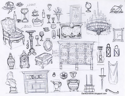
Interior Layout + Process
This layout is for some novel interior painting assignment inspired by the original Dracula story. Thought I would include same rough sketches. I did more than this, these are just samples. I didnt start the final painting yet.
Labels:
digital painting,
Drawings,
environments,
School,
Sheridan,
Sketches
Fighting Game Layout
Originally this was just an extra for my layout portfolio, but after I finished drawing it reminded me of those 2D fighters like King of Fighters, Street Fighter, Guilty Gear, etc. I love those kind of games (even though I suck) and we have to animate someone jumping for another class so I thought it would be cool to make a mock-up fighter of my own using this background as one of the stages.
Labels:
Drawings,
environments,
School,
Sheridan,
Sketches
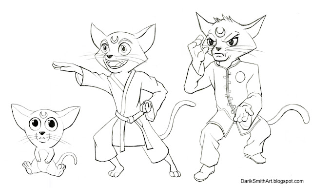
Character Design - Martial Art cat
We had to design a character from their birth to their elder years. I went through a bunch of bland ideas before decided to make a muscular guy. He becomes even more jacked as he aged which made it more interesting to design. Nuff words.

Labels:
Characters,
Drawings,
Finished Work,
School,
Sheridan
Tuesday, March 06, 2012
Unreal
I played with UDK some more during reading week. This map is based a little on a video tutorial series from 3DBuzz, but I went a bit overkill with emitters, sound effects and DoF, haha. The videos were great, I think if I had the time I know enough to create a badass level. The next step for me is to learn modeling&texturing static meshes which will take way more time to learn than UDK.
This sure beats the hell out of animating!
All the assets used in this map were from the UDK kit, none created by me.
This sure beats the hell out of animating!
All the assets used in this map were from the UDK kit, none created by me.
Labels:
3D,
UDK,
Video Games
Subscribe to:
Comments (Atom)


